3/27/2008

Gay Pride


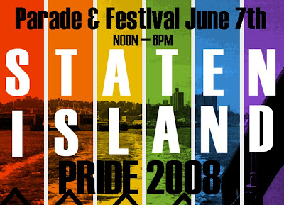
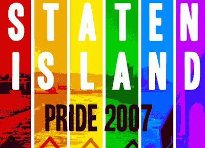
Compare:


In the year intervening, I've read some books on design, printing and typography, learned about digital image formats, and downloaded a decent image manipulation program (the GIMP).

This made 2008 much faster going to create.

2007 was done using MSPaint for the letters and arrangement, and Irfanview for the color. I sectioned the photo off with white stripes, then copied each section of the photo into Irfan, and individually shifted the color to my liking. Then I pasted the sections back into the original image.

For 2008, I used GIMP and actual, honest-to-God layers to do the colors and text all in one program.

Well, actually, I did the black text in Paint because I was having a clumsy time of it with GIMP's text tool.

I upped the contrast and posterized the underlying photograph so it would look more distinct when the image gets printed. Unfortunately, this gave me trouble with the text. I may wind up lightening the image once I get word back from boss.

The font, by the way, is Headline HPLS...I found it in a package of fonts meant for creating LARPing documents for an H.P. Lovecraft game. I like it because it's narrow, easy to read at a distance, and more graceful than some other fonts meant for distance-reading, like Impact. I think it might be a bastardized version of Haettenschweiler.

3/24/2008

Recent Stuff From DeviantArt


Open Mike night at a local coffeeshop. This was drawn on the back of a flyer while being bored by the musicians. About 3 or 4 acts came and went, including a fire breather. I was obsessed with getting the old crazy guy right, so I ignored the firebreather and didn't draw anyone.


This is Pikadeth. He's a user on GameFAQs & created "Pikadeth's Playhouse", a series of topics which have lasted 6 years now. His mom is really proud.


This is probably my first attempt at a landscape in years. I screwed up the top of the column but I like the grass and tree whorls. I'm like an autistic except I think machines are boring and ORGANISMS are neato.

Hee hee, organisms.


This guy is basically a penis joke. His name is "Droopy Loupe" and he hates furry fans. I mean, who doesn't?


A drunk duck. Soon after I drew this, I discovered there was a webcomic hosting site called Drunk Duck. Bastards.

Book Talks


Lectures and talks are nice because you have a figure posing right in front of you, and they WANT you to stare. It's even better if they make crazy gestures. Anne Moore for "Unmarketable" didn't move around very much, so all she got was that single figure drawing. Hillary was more fun to draw...but the talk was also more boring.

These drawings look nothing like Hillary's press photos, but if you saw her in person...you'd be all like..."That's just like her. You're a genius, Milky!"

Gorillas


Someone asked me to draw a gorilla driving a shark on wheels. I complied. I really liked the idea that he was driving with his feet...


The other stuff reveals that I don't know how to draw someone grasping a door knob...

Scrabble and Pacifism


This was drawn while he was taking a long time during a Scrabble match.


Same dude. I showed it to him and he seemed to think the guy was holding a knife at first. The little boy with the glasses is supposed to me. I actually quite like how it came out, and I've been reusing that nose shape for some other self-portraits I've done.

Horsies


This particular page just had the horse and rider on it at first. I came back to it weeks later and added the two stand-alone horses.


Original idea was Joan of Arc battling Death Cab for Cutie. Never bothered to finish it. The horse and rider are extremely wonky. I like the horse on the bottom, though his legs are weird.

A paper bag


"What a gorgeous, rich shade of brown!"


My friend is a Green Day fan. Her cat prefers chicken.

3/23/2008

Risk & Subway Bassist


These sketches are from a few days ago.

I tend to rush through my drawings and clearly the only one that looks even remotely polished is the lower left one with the "Risk is serious bizness" caption. It's a self-portrait. I'm a terrific geek.

The others are in various states of undress, as it were.

As a little kid, I would just straight-up draw characters and scenes out of nothing, using my ever-trusty ballpoint pen. This was very impressive, but ultimately limiting. Why? Because while all the detail I would put in was very nice, I'd have all the figures arranged in boring poses with stock expressions that I'd have drawn a million times before. I'm trying to get away from that.

The guy on the first page, top right, is a good example of my first approach. I was aiming to draw a funny little old timey fat guy, but I got so caught up with other details that he was left with a very bland slouch. Maybe he's just chilling. Maybe he's stoned. Yick.

Second page, top, I was posing a skeleton and wound up with a much more expressive figure. Now, hardly either of those drawings are polished or complete, but I think the girl in the panels is more successful. She's not as detailed, but I think the fat guy needs more cleaning and messing around with, whereas stick-girl just needs flesh and decent backgrounds.

Bottom right dude on the first page is in sort of an in-between state: he's expressing SOMETHING, but the scene needs a lot of cleaning up and some reposing. He's supposed to be a misanthropic jazz musician on a subway. Could you tell?

Statement

Any time I put anything up at DeviantArt, I have to navigate a twisty maze of artistic subdivisions.

Hmmm...is my scan of a notebook page cartoon that was colored with GIMP 1) digital art, 2) traditional art, 3) a figure drawing, 4) a comic, or 5) a scrap?

The fact of the matter is, I don't fucking care.

I just want a place to concisely display my sketches, MSPaint comics, and commissions, write a little bit about them, and have the pictures and writing both within easy reach for my eyeballs or anyone else's.

Therefore this.

I'm going to start with some recent scans, then see how it goes.

Hello World