4/25/2010

2 Banners that I painted back in 2007 and 2008


This was outside the Staten Island armory on the anniversary of the Hiroshima bombing (Auguat 6, 2007). The banner was about 20 feet long, and created with paint and canvas that we had salvaged. It reads "Nukes Off the Table".


This was created in the spring of 2008, using the same paint and same roll of canvas. Boy are we thrifty. Our Food Not Bombs project lasted from Thanksgiving of 2007 until April of 2008, every Wednesday in front of Staten Island Borough Hall. We fed people for free with food we had salvaged, because me and my friends are very fond of salvaging things. Eventually we had to salvage our free time, because there were only 3 of us running the whole thing and it took a lot of work to maintain.

4/23/2010

Magazine Popeye Issue

This is the second issue of my Publication Design class project, a magazine on cartooning and comics. It's a feature on Popeye's "Thimble Theater" re-issues. Work still in progress. I did NOT create any of the content, including photos, drawings, and the article itself. The authors of their respective work reserve their rights to it. Also note that this is not a commercial publication, but a project for class.


Magazine JohnK Issue

I'm designing 3 issues of a magazine for my Publication Design class. The magazine is about cartoons and comics. Here's an issue currently in progress, on John Kricfalusi. I did NOT create any of the content, including photos, drawings, and the article itself. The authors of their respective work reserve their rights to it. Also note that this is not a commercial publication, but a project for class.


4/22/2010

Photoshop Exercises

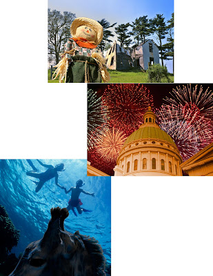
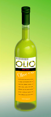
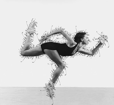
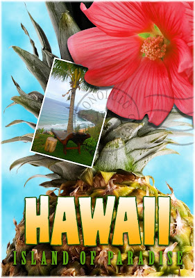
This is a collection of my Photoshop exercises. I did not get to choose these images, I just performed editing.


This was my second exercise, simply selecting and placing objects in photos and performing some color adjustments.


This was a class on manipulating text.


This was a class on text paths.


This was a photo collage that I had to assemble and adjust accordingly, using pre-chosen pieces.

4/16/2010

Movie Poster, Monkey Notebook


This is for Photoshop class. We had to design a movie poster that included a picture of ourselves. I had an old image that I had taken with a bad digital camera, that came out kind of noirish, so I used that. I wanted a film noir/50s psychological thriller kind of feel.


We had to do a product design for our Illustrator class pattern, so I did this up in Photoshop.