4/23/2010

Magazine JohnK Issue

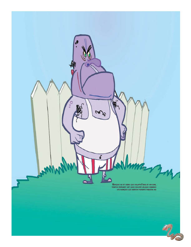
I'm designing 3 issues of a magazine for my Publication Design class. The magazine is about cartoons and comics. Here's an issue currently in progress, on John Kricfalusi. I did NOT create any of the content, including photos, drawings, and the article itself. The authors of their respective work reserve their rights to it. Also note that this is not a commercial publication, but a project for class.


4/22/2010

Photoshop Exercises

This is a collection of my Photoshop exercises. I did not get to choose these images, I just performed editing.


This was my second exercise, simply selecting and placing objects in photos and performing some color adjustments.


This was a class on manipulating text.


This was a class on text paths.


This was a photo collage that I had to assemble and adjust accordingly, using pre-chosen pieces.

4/16/2010

Movie Poster, Monkey Notebook


This is for Photoshop class. We had to design a movie poster that included a picture of ourselves. I had an old image that I had taken with a bad digital camera, that came out kind of noirish, so I used that. I wanted a film noir/50s psychological thriller kind of feel.


We had to do a product design for our Illustrator class pattern, so I did this up in Photoshop.

3/28/2010

I had to make a "Do Not Disturb" sign although I sleep in a double-ended room


People can walk through any time. It's more of a hallway.

Witness my shoddy cutting skills. Edgy indeed, and I don't mean the bloody blade. I hope we have a fresh emery board somewhere, because the sand paper is pretty dull.

Monkeys and Robots


Robots and Monkeys

3/22/2010

Some work from school

All of these are works in progress.


This was for Photoshop class. We had to collage together various scans of fabric to create a summer scene. The boy and the monkey are from an encyclopedia on the events of 1970, and I had to color them because they were originally in black and white. The rest were embroidery with various filters or color gradients applied to make them look more like a naturalistic scene.


This is for Intro. I guess severed limbs are becoming part of my style.


For Adobe Illustrator class, we had to make a building to demonstrate our knowledge of shapes, grouping, and color swatches. I created the double curve on the onion dome by layering two circles over the dome and turning them the same color as the sky, and the arched windows with more circles over rounded rectangles. The soda bottle is a stretched circle. The crescent moon is two circles, slightly displaced. The chain link fence is a group of rounded rectangles. The pennant string is a warped ellipse. I went crazy with the curves.


For Adobe Illustrator class we also have to design a pattern. This is one I did today, inspired by the "Monkey Vs. Robot" song. Oh crap, I just realized the video was made at Coney Island!